|
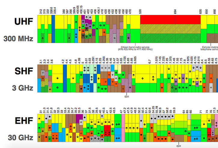
The Australian Communications & Media Authority, or ACMA, published a wall chart for radio frequency spectrum allocations in 2013. For RF geeks this is a beautiful representation of what services sit where in different frequencies of radio spectrum. It's interesting to look at to see how tiny the portion of spectrum 802.11 (Wi-Fi) uses. Below is a screenshot of just a small corner of the chart and as you can see it is hard to pinpoint the 5GHz WiFi frequencies hiding in amongst this subset of data. Check the whole chart out, and download it as a PDF here.
Or if you have the time and like reading documents like this here is the totally verbose text version of the same information.
Comments
|
WifiHaxWe build and optimise networks. Continuous learning is our secret to being good. Along the learning journey we will share things here... Archives
May 2024
Categories
All
|


 RSS Feed